
DVD COVER
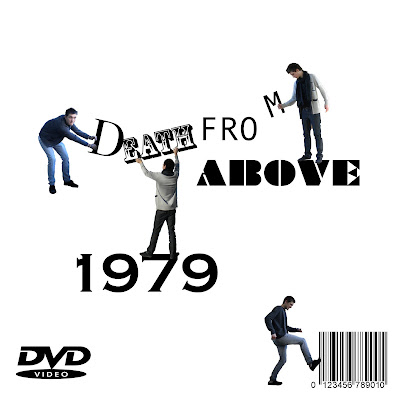
I wanted to do something quick eye catching with a minimal modern style. I used members of the band pulling and ripping off the titles of the DVD cover. This Combined also the elements of the video with a consept of the band in this other world, also bringing together animation and real life.
Labels:
gareth bowen
Thursday, 26 November 2009
our magazine advert so far
This the image that is going to be the background:
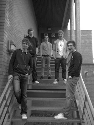
Our magazine advert is going to advertise the CD cover we are producing.
We are going to put surreal heads on their heads. The heads are going to be from the music video. The advert is also going to have the name of the band and the name of the CD at the top of the page. At the bottom will be when it is released and where. It is also going to have ratings from newspapers and various music magazines. Parental advisory logo is also going to be featured.
Tuesday, 24 November 2009
Initial ideas!
CD COVER
-use the heads from our music video on the front
-our band is alternative so we want surreal images on the CD
-band name or album name or both?
-black and white
-The font can be rough and messy to suit the image of our band
DVD COVER
-same as the CD cover but on the back it will include shots from the music video
-black and white
-all songs listed
-band name or album name or both?
MAGAZINE ADVERT
-where and when you can buy the DVD/CD
-price?
-similar design to the DVD and CD cover but with more visuals and images
-heads from the music video
-black and white
-animated heads
Conventions of a magazine Advert
Magazine adverts generally look similar to the DVD/CD that they are promoting. Pop and indie music groups generally have the bands photo on the cover and more alternative groups generally have a logo that relates to their genre of music. They also include where and when you can buy the CV/DVD and sometimes the price. They will also generally have the bands name/album name.
Labels:
ashley
Digi-pack
For the next part of our project we are going to make a digi-pack which relates to our music video. This will include a CD/DVD cover design and a magazine advert promoting this CD or DVD.
Normally on a CD/DVD cover there is the bands name so the customer knows what brand they are buying. There is also an image that show the bands image. This can be either a photo of the band or their logo. Pop and indie music groups generally have the bands photo on the cover and more alternative groups generally have a logo that relates to their genre of music. Also is the name of the album and sometimes some of the singles that are included in that album. If it is a DVD then special features are sometimes mentioned.
We will keep all of these things in mind when constructing our CD or DVD cover.
Labels:
ashley
Friday, 20 November 2009
analyse of 'the friendly fires' mag advert2
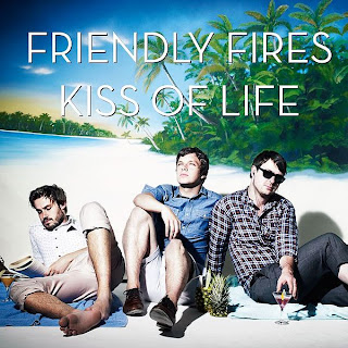 am going to analyze the advert for 'the friendly fires' they are the band of the summer and have a series of hits such as: the skeleton boy and kiss of the life.
The advert itself is a standing out colorful advert which can grab the attention of the viewer quite easily. Its quite hard to see what the bands genre is, as there is no sign of any rock or RNB within the advert. Also it doesn't show any sign of where the CD can be brought.
It does clearly state that it is a good CD as it states that it was 'The Mercury prize nominated album' and 'The band of the summer' said by the observer.
You can clearly see who the band are as they are in the middle of the page standing out so you know exactly who the band our and how they look.
Labels:
by william wade
Thursday, 19 November 2009
analyse of mag advert 1
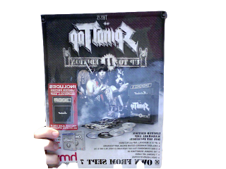
It is very clear where and when you can purchase this album. It states exactly what you will get including a free Marshall Amp which will entice people to buy which is very clever.The advert is mainly focused on the free amp to entice customers.
Labels:
ashley
Final video feedback
Overall we were pleased with our feedback, there were so good comments and on the whole we agreed on the sort of style and look we were going for. There were some things that we weren't pleased with. We were hoping that the animation would cover all of the faces, but there wasn't the angles on animation so the real footage went with the animation. Also we had some animation so the characters were lip sinking and moving there mouths but because of the lack of time and poor planning we didn't manage to put that on there. However there were good points...
People felt that the edge sketchy look was good and matched the music.
Like that s wasn't a narrative that we stuck to and the animation allowed us to be free in our editing choice even though editing was really time consuming and challenging.
The drawings were a good quality and added some a profectional look to it.
Editing and fantasy elements was good and over all idea was interesting and quite unique.
Labels:
ashley,
gareth bowen,
Henry Wade,
William Wade
Tuesday, 10 November 2009
Animation
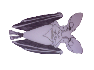
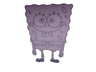
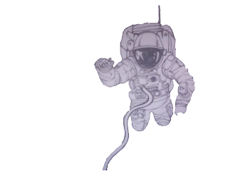
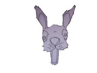
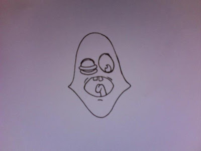
Here are more sketches for our animation on our music video; these sketches are sketches Gareth has drawn to include in our video, these are not all of the sketches but a few we have included into our video. Our video is including some serial and animated pictures and we have managed to make it look very effective by making them move. We have included them in our video and with the actors in the video thinking they are seeing things.
This works very well and make our video unique and different than any others.
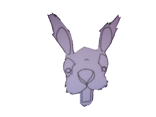
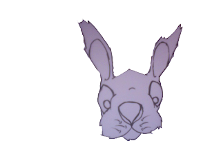
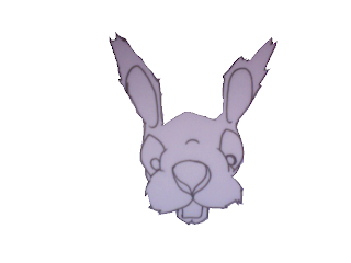
This works very well and make our video unique and different than any others.


Friday, 6 November 2009
Production meeting 4
We are now in the final stages of completing our music video. With two weeks to go we have not got long left. We have the opportunity to come in some evenings and get some extra hours of editing done. Ashley is going to come in on wednesday evening from 5pm till 8pm and then gaz, william and henry are coming in on thursday evening from 5pm till 8pm.
We have shot all the footage we need so all we need to do now is concentrate on the editing part. It wont be easy but we all committed to producing a very good music video.
We have shot all the footage we need so all we need to do now is concentrate on the editing part. It wont be easy but we all committed to producing a very good music video.
Teacher feedback
This blog is looking great but it would be good to see you all adding blogs from home as it seems that lessons are being used a little too much to blog rather than do practical work such as editing. Your sketches must be put on the blog as where you have done this, it really strengthens your blog as it shows practical progression of your idea. You MUST also start editing your sketches (animating) as even with the extra edit evening you are cutting it extremely fine and I am concerned that your amazing idea it going to have to be sacrificed in some way in order to get it done on time.
Labels:
EMC
Feedback
We were quite pleased with our feedback, we knew that the rough cut was very far from our final idea and being completed. Also the animation is very rough its isnt as finished as it will be. Many people picked up on this, saying shots looked random. And they do without the animation, but when that put in feel it will look normal. People commented on the fact they liked the black and white effect that we added, which we were pleased with. Also peole liked the mise en scene and sort of gritty urban suroundings that we used. We were aware we had alot to do still and predicted that people we comment on that however the feedback not about his was really helpful and we were pleased with the good comments we recieved.
Labels:
ashley,
gareth bowen
This video, in some ways is very different to ours. The type of animation and the fact it isnt a music video. Beside the fact I just really like it and it very unusual, I really like the scratchy doodley look to the characters and drawings. It has a rough almost home made feel that we would like to achieve. Further more this scratchy unacomplished look, reflects the music of the band less regonised and not mainstream.
Labels:
gareth bowen
Thursday, 5 November 2009
Editing so far
These are some screen grabs of how the editing of our music video is going so far;
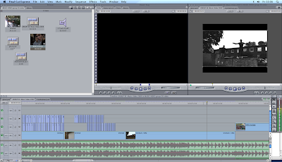
In this part of the editing we reversed the footage to make the main characters appear to be jumping back up onto the wall.
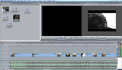 After a minute of the music track the lyrics talk about the city so we included some mise en scene footage of the city cambridge that was shot out of a car window and sped it up by 900%
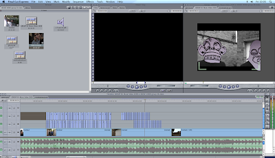 This the start of our animation and as you can see we need to cut the animation and move it every time the main characters head moves. This is very time consuming but when finished it really works.
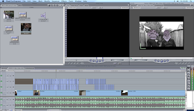
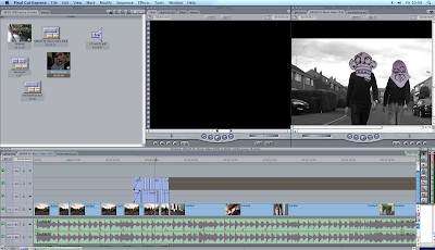

In this part of the editing we reversed the footage to make the main characters appear to be jumping back up onto the wall.
 After a minute of the music track the lyrics talk about the city so we included some mise en scene footage of the city cambridge that was shot out of a car window and sped it up by 900%
 This the start of our animation and as you can see we need to cut the animation and move it every time the main characters head moves. This is very time consuming but when finished it really works.

rough cut
This is a very rough cut of our music video at the moment and we know that we have alot of work ahead of us. Most of which is the animation
Labels:
ashley,
gareth bowen,
Henry Wade,
William Wade
Target audience
Our target audience, isnt clearly defined by age, sex or music type. We feel it is a wide group of men and women raging in age, probably with a wide range of intresting in music and videos. There isnt a clear group that we are targeting. Our video is quite unusual and creative not typical of ordanary rock of videos from other genres. Further more As the groupis sort of playing and alternative style of music the video matches this by also being quite unusual. I feel this will target out audience quite well.
Labels:
ashley,
gareth bowen
target audience
The Target Audience is the audience our video is set too, what age group and what kind of people we want this video to attract. Black History month played loud, heavy metal influenced, dance-punk on a bass and drums combination. So they as a band and music attract the more rock side of people. Our group using their song and creating the video has kept the rock audience but has also introduced a new audience of of the younger generation.
Black History Months style was quite heavy metal rock and this was also carried on for their DVD covers and C.D covers etc.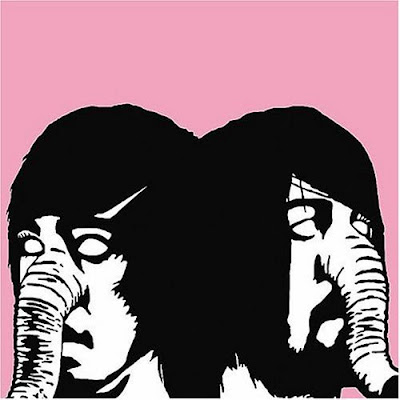
This picture shows what the style of Black History Month was and our style and image of our Music video is a bit different. The picture is very surreal and that is what we are going to do for our style. Their style by looking at the picture is very plain and different and ours will be more detailed and also surreal and different, this is to try and keep the same style and image of Black History Month but also create a new design and change it around to fit our music video.
We are in progress in creating our actually CD and DVD covers and we have used this image to help us to create our covers. Within our video we have used different faces and this is similar to the elephant Black history month have used but we have used more alien like faces and we are including these in our CD and DVD covers.
Black History Months style was quite heavy metal rock and this was also carried on for their DVD covers and C.D covers etc.


This picture shows what the style of Black History Month was and our style and image of our Music video is a bit different. The picture is very surreal and that is what we are going to do for our style. Their style by looking at the picture is very plain and different and ours will be more detailed and also surreal and different, this is to try and keep the same style and image of Black History Month but also create a new design and change it around to fit our music video.
We are in progress in creating our actually CD and DVD covers and we have used this image to help us to create our covers. Within our video we have used different faces and this is similar to the elephant Black history month have used but we have used more alien like faces and we are including these in our CD and DVD covers.
Labels:
William Wade and Henry Wade
location shots in cambridge and linton
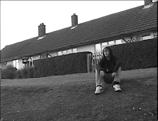
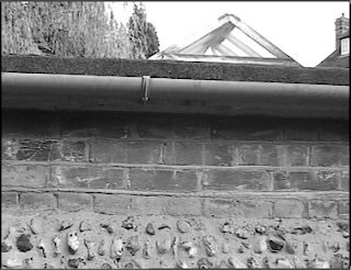
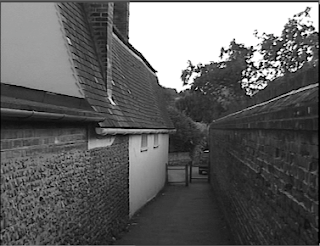
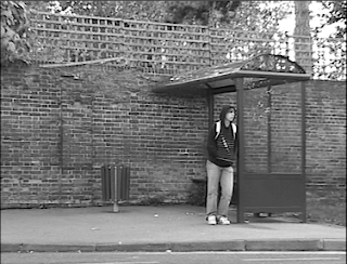
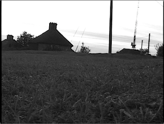
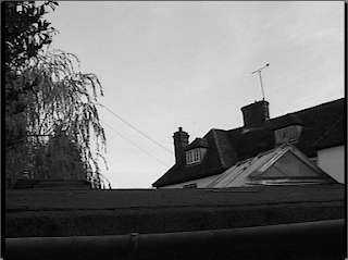
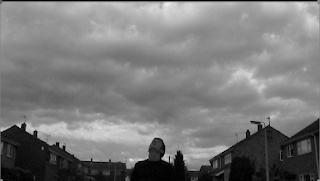
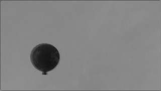
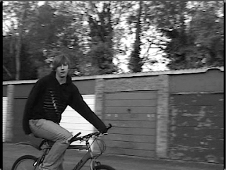
These are shot from some of our earlier footage, we are using these as a rough guide to know where to animate the heads etc. This is acting a basic guide so they don't look out of proportion.
Labels:
ashley,
gareth bowen
Tuesday, 3 November 2009
A summary of what we need to do
This is a summary of what we need to do in order to complete our music video project.
FILMING
So far we have shot around half of our footage. We have acquired our own camera for shooting and going to film the rest of our music video footage within the next week.
What we need to shoot;
EDITING
We have already started the animation for our music video as demonstrated in the test footage. And we have all the drawings and sketches so all we need to do is apply to the footage in final cut.
inidividual evaluation of how the filming and editing has gone
as a group so far we have got quite far into the filming progress and have managed our idea of putting crazy looking faces on our actors and has come out looking pretty good. We have done a few hours of filming in different locations and we are now in the process of editing it on finalcut and getting it finished.
What has gone well and not so well?
During the filming we have had some great success of catching some great shots and managing to make them look great within editing them within finalcut express. Also another good thing we have done is manage to get together as a group and work with each other to create a great music video.
Most things have gone pretty well so far apart from a few mistakes we have made as a group, a lack of organization is not helping us as we as a group are not chatting to one another about picking up cameras ECT. We dealt with this problem by getting a camera from family members, this benefited us a lot as we got some extra filming hours.
During our filming and editing nothing has gone to wrong and most things have been quite a a success.
Labels:
by william wade
Sunday, 1 November 2009
individual evaluation of how filming and editing has gone so far - ASHLEY
As a group we have had our ups and down on this part of the project. Our planning and research went really well and was next to perfect. But when it came to the filming and editing process we did have some difficultys but delt with them the best we could.
What went well:
We chose some really nice locations to shoot. The first was in cambridge city centre. We were looking for a rough urban area to go well with the music video and we found a few areas. We also shot in Linton and managed to get abit of footage.
When editing we decided to desaturate the footage to go well with the animations and this worked well. We have started some of the animations and they work on the footage. It is very time consuming but we are willing to spend extra time of this project.
Problems we have faced:
From the first day of filming we have faced problems. When in Cambridge our tripod didnt work fully so the footage was shaky and not still. Fortunally the media department reliased that this was their fault and gave us more time to shoot. So we organised a full day to shoot on a sunday. We had our own camera but had the wrong discs for it and couldnt find any anywhere. But the last placed we tried had the right discs. But by this time there was only a couple hours of daylight left so we didnt manage to get all the footage we needed.
Due to this our rough cut was only half done.
But we are working hard to compleate this project. We have arranged a few more days to shoot and extra time to edit.
Labels:
ashley
