PART 2
Monday 14 December 2009
Gareth Bowen Evaluation
In what ways does your media product challenge or develop forms and conventions of real media products?
Our project was to create a music video and digi-pack for a band. We wanted to create something original and interesting to watch but at the same time remain aware that an important part of the exercise is to market and promote the band. This band is relatively little known and its music is not mainstream commercial. To target the right audience the supporting video needed to match the less poppy, more urban renegade nature of the sound this band makes.

This screen shot from Gorillaz’ video for Dare illustrates well the theme that runs through their videos. The lighting throughout is dramatic, impactful and captures the imagination quickly. Stark shadows and colourful imagery give their work an energy that reflects the music. At the same time, the warmth and security of the pastel colours are in sharp contrasts with the exaggerated humanoid features and the dark gadgetry of some futuristic urban scene, giving the whole thing an antagonism and an edge…. just like the music

The mise-en-scene for the video shot footage was critical in two ways. First we used it to set the contrast with the cartoon images. The costumes were plain, dark and basic… grungey polos and jackets… whilst dominant, they needed to look commonplace in an everyday neighbourhood in an everyday urban setting. Without this familiarity and “ordinariness” the cartoon images would be less “extraordinary” in contrast. Hence, the video footage was as important as the animation effects. Second, the urban nature of the environment was in close step with the underground tones of the music.

In lighting the video we used the lighting in a way that created dark shadows and a stark feel, which generated a more intense and generally exciting image. In this shot, for example, we used angled lighting to contrast the top and bottom of the frame.

Capturing the band at interesting camera angles generated visual interest too. The fantasy theme was captured well through this use of the camera. As in this upward shot, the viewer is reminded of the kind of cinematography typically seen in the “western”. It continues the theme of popular culture through the reference to popular cinema.

How effective is the combination of the main product with the ancillary text? (Video and admag)

In this example… Bloc Party… we see the conventional bold title, band pic and album pic where the content is really clear…. What you see is what you get.
Not drawn as a frame from the video, we staged a still black and white shot of the band and then introduced the cartoons so as to give us the single image that would capture the look and feel of the video… urban, ordinary… extraordinary

On reflection, we felt that we could have extended the advertising impact through the use of some “teaser” images… a cartoon head on a single band member or on a popular image of a celebrity advert for example… to “pre-promote’ interest.
In our case, interim verbal feedback suggested that the original idea (doodley, animated mix, underground, etc) had landed pretty well. There was good apparent association of the images with the soundtrack and we achieved our aim of creating intrigue for an underground sound.
During our research, we used the Internet extensively, looking at band and fan web sites, You Tube and the like to get a perspective on the current practices and responses in the music video medium. Additionally we explored the use of animation in film and music. In both cases it struck us that the opinion of “expert commentators” has been replaced by the collective feedback of the “user” in forming views on reactions and trends. In this respect blogs and interactive sites were a critical new technology in developing our ideas and getting a feel for what people think.
To plan the work we drew a comprehensive storyboard detailing the key shots, settings, rate of flow and so on. The storyboard frames were photographed individually and set as stills in Final Cut to produce an animatic that could be synchronised with the music. This allowed us to identify and edit the pace, flow, gaps, repetitions and links that could be changed before real shooting and artwork began. The availability of such software applications brings the prototyping of pre-production pilots within easy reach and would have been possible only with expensive editing equipment only a few years ago.
For the magazine advert and CD cover, Photoshop was again used extensively to manipulate text and image to replicate our overall themes.
In all aspects of evaluation, the use of blogging enabled us to create a virtual “workroom” environment. The team could interact remotely by posting new output, thinking and ideas. We could also gauge reactions and capture feedback.
Ashley Andrews - Individual Media Evaluation
1) In what ways does your Media product use, develop or challenge forms and conventions of real media products?
From the beginning of this project, we have gone against conventions to make something that was unique and different. When we saw ‘try life in another language’, where they use animated heads with real footage, we immediately knew that this is what we wanted to do for our music video.
2) How effective is the combination of your main product and ancillary texts?
I feel that the continuity of style between the music video, digi-pack and magazine advert is strong with clear links between all three products and ancillary texts. We have a black and white theme that runs throughout our entire project. The reason for this is because it goes well with the animation. And that is another thing that runs throughout our project, the animation. We animated the heads of the band members for a surreal and quirky look.
3) What have you learnt from your audience feed back?
Our audience feedback has been invaluable to us because it is them who has to like our products and not us. Using our audience feedback, we improved our main product and ancillary texts to their full potential.
The feedback that we received was from media teachers and fellow media students who where doing the same project. So the feedback was honest, supportive and professional. The feedback we most appreciated was constructive criticism because we then used this to improve our main product and ancillary texts.
For our main product we got feedback at various stages of the project. This is important because we could act upon our audiences comments and improve our music video. We first got feedback in the research and planning stages of the project. Here are some comments we received;
‘Good introduction’
‘This is a really good blog with lots of research into similar products.’
‘It is clear that you have a solid idea of style.’
‘influences shown well’
‘good use of more ideas’
‘could be hard to deliver’
‘nice mood board’
‘Theme and ideas easy to understand’
‘micro + macro elements good idea and very clear’
‘Emailing band (Did they reply?)’
Most comments were positive which gave us a real good moral boost. The one comment we picked up on was, ‘could be hard to deliver’. That is because the animation would be hard to put on footage and it would be very time consuming but because of this comment we decided that we were going to commit to this project.
The next feedback we received was after we made our rough cut. The main comments was that it didn’t look even half as finished. We understood this and worked harder to get it finished on time. There were some good comments which were that the black and white theme worked well with the animation.
The last feedback we received for the music video was when we had finished the video. Here are some comments;
‘the edge sketchy look is good and matched the music.’
‘drawings were a good quality and added a professional look to it.’
‘Editing and fantasy elements was good and over all idea was interesting and quite unique.’
I am glad that most people liked and enjoyed it but there were some constructive criticism which was that the animation was not on the heads all of the time. If we had more time and longer to do this project, a lot more time would have been spent on the editing and animation part of the music video. But nonetheless I am still proud and satisfied with the outcome of the music video we have produced.
We also received feedback for our ancillary texts and here are some comments;
‘Writing is hard to read because of the background’
‘Liked the rating’
‘The black and white relates well to the video’
‘Images on the back work well as they relate to video’
‘Lacking some information such as production logo’
‘Just screen grabs from that video even though it contains other videos’
‘The speech bubble is a good idea’
These were some good feedback but if we had longer to complete these ancillary texts then more could have been done to make them the best we could.
4) How did you use new Media technology in the construction and research, planning and evaluation stages?
The advantage of internet use in this project has helped us immensely. In the research and planning stages of this project we used youtube.com a lot to look at similar music videos to help give us inspiration. Without youtube.com we would not of discovered this brilliant video, ‘try life in another language’;
This is the video that started it all. After viewing it we knew that we wanted to do something similar. Other videos that helped our research were;
Gorillaz - Dirt Harry
Example - Watch the Sun come up
Gorillaz - Clint Eastwood
Eminem -
Kid Cudi - Day ‘n’ Night
Raveonettes - sound of colour
All of these music videos are on youtube.com. They all feature animation mixed with real footage and because this was our idea for our music video, it helped us get more ideas.
When planning when to shoot we used Google maps to help organize where and when we needed to meet up to film.
Final cut editing software really helped us with what we wanted to do with our music video. Most of the project has been spent on editing our video. To get the black and white theme for our music video, we desaturated the video and then played around with the brightness and contrast to get the right look that we wanted. We added a few effects aswell, for example, when the band members are ‘jumping’ backwards onto high walls, all we did was reverse the footage and slow it down. The animation was the hardest part. Once the drawings were on paper we would upload them onto our Apple Mac and edit them on Photoshop. The we converted the animation into a PNG file which was then opened on final cut. It was easy enough putting the animated head on the footage but every time the human head moved, the animation needed to be cut and moved. This was very time consuming. 10 seconds of footage took 30 minutes of editing.
Photoshop was used in the making of our ancillary texts. The magazine advert and digi-pack looked great because of this software.
Sunday 13 December 2009
Williams Evaluation 11/12/09
In What ways does your media product use, develop or challenge forms of real media conventions?
Starting off with looking into our research and how when researching we looked into many different media products, we came up with our idea by looking at the video 'Try life in another language' which is faces on humans and has no main story line, many different shots with band members doing different things, e.g riding around on a bike. We also looked at other media products such as Gorillas videos and also many more. Analysing these videos helped us come up with different ideas to use in our music video.
When actually coming to filming our video, all of our research into media conventions had come to use.
Looking into our Digi Pack and magazine advert, we haven’t really used forms of real media conventions as we wanted to come up with something different and serial.
Our Digi pack and magazine advert where done from our own initiative; we wanted to relate them to our music video as much as we could, so we tried to bring across certain features from our music video to our Digi pack and magazine advert.
As a group we decided to bring across the theme of black and white back ground and the faces we used in our video, still keeping the humans faces hidden from the viewer.
The real media conventions we looked at were a lot more detailed than our final cut video and also a lot better quality, this is all because of the time issue we had, we couldn’t make it as affective as people wanted it to be, but we believe the final video ended up being rather good and having it not so perfect went towards the sketchy kind of feel towards the video. Real media products such as ‘Day and Nite’ which is featured on our blog is a very effective video and doing drawings and making them pop up like they did is what we were aiming for but we thought having just the faces covered and with very little colour worked better than we expected.
Overall we found that by looking at real media conventions we managed to use good ideas and try different things out.
How Effective if the combination of your main product and ancillary texts?
Looking at our music video and our ancillary texts I can see our continuity throughout our ancillary texts and our music video is quite clear. There are some things we have brought through from our music video to our ancillary texts.
I believe our continuity was good throughout our video and our ancillary texts. We managed to make our continuity remain good from our video and our ancillary texts by making them all similar and taking things from our video and putting them in our ancillary texts, this was to really make the viewer establish the continuity.
We made our continuity good by using the faces and also bringing through the black a white theme. The only slight continuity error we thought was our CD cover as it was red. We used this colour as it would stand out to a viewer, and also if it was black and white like our main theme the animated face would stand out as much as it does on the red and not look very effective. We did try and keep the continuity of the CD cover by putting shots of our video on there and alos more animated faces but without the humans.
I believe the DVD cover was one of the best ancillary texts and the best in our Digi pack. The DVD cover continued the elements of the video with a concept of the band in this other animated world, also bringing together animation and real life. This is very eye catching and the continuity of this is great as very serial, the black and white was brought over again to really establish the link. But we decided not to put faces on the characters, and this was because in our music video there were some scene with the characters having no animated faces and so you actually got to see the faces of the humans in this serial different animated world.
The magazine advert shows great continuity from our final music video to our advert, using the faces on each character so they are kept hidden to the viewer, also using he black and white theme. Throughout our music video and ancillary texts we as a group have managed to keep the continuity throughout and also make our ancillary texts seem very real, by adding dates when the CD is out to buy, bar codes and also titles.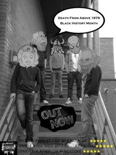
What have you learnt from audience feedback?
Throughout this whole project, as a group we have received a lot of feedback from individuals, and also other groups who are doing a similar project. The feedback we have received has helped us make our video as good as it can be.
We received feedback about our blogs and had seen what needed to be done and go in it. We showed our rough cut and our ideas which we wish to include, we received some great feedback, constructive criticism also which we benefitted from. As our audience wanted something from it we would try and work towards what they had said. There is some feedback we received from teachers and other groups, about our video (final cut video)
• Editing and elements where very good and overall ideas was interesting and quite unique
• The drawings were good quality and added a professional look to it
• Felt that the sketchy look was good and matched the music nicely.
Early feedback of plan and music video idea.
• Good idea
• Could be hard to deliver
• Influenced shown well
• Very comprehensive
The feedback was a mix of positive, negative and we got a bit of constructive criticism to help us improve our final video and also planning etc. We have changed some of the thins which we got from our feedback, E.G some people wanted us to do more of a sketchy feel and also make more things fit in with each other, so that’s what we did, included many different drawings of animated faces, e.g George Bush and Spiderman
Some of the stuff we thought we definitely needed to change because one of the things we were debating to do was have lip sinking in our video, but we thought it would be a bit more different with no lip sinking and just the animated faces over the characters ect. The feedback we received from this was a bit negative as they thought we should try and make the faces look like they are singing, but unfortunately this was a bit out of our league and we just didn’t have the time to do this which was rather disappointing. Everyone thought this music idea was a bit unique and would be quite hard but I believe we have pulled it off and managed to really create a different, sketchy, serial music video. Overall the feedback received did come to great use and we benefited a lot from all of it we received.
How did you use new media technology in the construction and research, planning and evaluation steps?
Whilst filming our media music video we had to use a various amount of new media technology throughout our planning, construction and evaluation steps. Our planning stages started off with a lot of internet research. Using YouTube a lot to get a lot of information on our music idea, we did a lot of research on many different music videos, just to get some more ideas into what we can include in our music video. Internet is a vital key when filming anything as you have to research many things to try and make your video very interesting and good.
Photoshop on the Apple Mac became very useful and helped our group a lot, as we had lots of sketches Photoshop was used a lot, to cut out our sketches and edit them if needed so,. Cutting them out was a long process as we had many different pictures and cutting them out had to be perfectly done. Gareth our group member had also done a flick book of sketches. A good example of this flick book was in our music video, when a character is walking a long and the eye gets pulled out of the picture. If we had a little more time we could have used the flick book even more as it was very effective and made it look more like the faces where actually alive in this new different world. We managed to make this quite effective, and go very well with the video.
As you can expect this was very time consuming and things took quite a while, we had to set things out very carfully and put a time on everything we needed, so we kept to a tight schedule on when to meat and when to film. This was so we to show how we were going to do it and how we were going to do it. As a group we worked well together and found this schedule we kept to was all very tight but managed to work.
This is just a brief outcome of the media technology we used whilst planning and filming our media product. But overall all the new media technology we used has become very useful and helped us finish and edit our music video. Finding out new things on final cut express for us to do different more unique things to make our music video more serial and quirky.
Another media technology we used was the actual main part of our video and that wa putting the faces on the humans and this is alled 'Rotoscoping'Rota scoping is an animation technique in which animators trace over live-action film movement,fram by frame, for use in animated films. Rotoscoping was the main idea of our music video and was different to what other grouos had done but ended up going well.
We used a lot of new media technology throughout our music videos planning; research and construction and all benefitted our music video a lot.
Conclusion of Evaluation/ final video
From the start of this project we came up with the idea of putting animated faces on human bodies and trying to create a whole new world in the space of our music video. We manage dot do everything we were supposed to do and fit in many different posts in our blog to make it as good as it can be, creating a great video coming from some great ideas. Everything I have mentioned in this evaluation is all to do with what I and my group have done within this project of creating a music video
Starting off with looking into our research and how when researching we looked into many different media products, we came up with our idea by looking at the video 'Try life in another language' which is faces on humans and has no main story line, many different shots with band members doing different things, e.g riding around on a bike. We also looked at other media products such as Gorillas videos and also many more. Analysing these videos helped us come up with different ideas to use in our music video.
When actually coming to filming our video, all of our research into media conventions had come to use.
Looking into our Digi Pack and magazine advert, we haven’t really used forms of real media conventions as we wanted to come up with something different and serial.
Our Digi pack and magazine advert where done from our own initiative; we wanted to relate them to our music video as much as we could, so we tried to bring across certain features from our music video to our Digi pack and magazine advert.
As a group we decided to bring across the theme of black and white back ground and the faces we used in our video, still keeping the humans faces hidden from the viewer.
The real media conventions we looked at were a lot more detailed than our final cut video and also a lot better quality, this is all because of the time issue we had, we couldn’t make it as affective as people wanted it to be, but we believe the final video ended up being rather good and having it not so perfect went towards the sketchy kind of feel towards the video. Real media products such as ‘Day and Nite’ which is featured on our blog is a very effective video and doing drawings and making them pop up like they did is what we were aiming for but we thought having just the faces covered and with very little colour worked better than we expected.
Overall we found that by looking at real media conventions we managed to use good ideas and try different things out.
How Effective if the combination of your main product and ancillary texts?
Looking at our music video and our ancillary texts I can see our continuity throughout our ancillary texts and our music video is quite clear. There are some things we have brought through from our music video to our ancillary texts.
I believe our continuity was good throughout our video and our ancillary texts. We managed to make our continuity remain good from our video and our ancillary texts by making them all similar and taking things from our video and putting them in our ancillary texts, this was to really make the viewer establish the continuity.
We made our continuity good by using the faces and also bringing through the black a white theme. The only slight continuity error we thought was our CD cover as it was red. We used this colour as it would stand out to a viewer, and also if it was black and white like our main theme the animated face would stand out as much as it does on the red and not look very effective. We did try and keep the continuity of the CD cover by putting shots of our video on there and alos more animated faces but without the humans.

I believe the DVD cover was one of the best ancillary texts and the best in our Digi pack. The DVD cover continued the elements of the video with a concept of the band in this other animated world, also bringing together animation and real life. This is very eye catching and the continuity of this is great as very serial, the black and white was brought over again to really establish the link. But we decided not to put faces on the characters, and this was because in our music video there were some scene with the characters having no animated faces and so you actually got to see the faces of the humans in this serial different animated world.
The magazine advert shows great continuity from our final music video to our advert, using the faces on each character so they are kept hidden to the viewer, also using he black and white theme. Throughout our music video and ancillary texts we as a group have managed to keep the continuity throughout and also make our ancillary texts seem very real, by adding dates when the CD is out to buy, bar codes and also titles.

What have you learnt from audience feedback?
Throughout this whole project, as a group we have received a lot of feedback from individuals, and also other groups who are doing a similar project. The feedback we have received has helped us make our video as good as it can be.
We received feedback about our blogs and had seen what needed to be done and go in it. We showed our rough cut and our ideas which we wish to include, we received some great feedback, constructive criticism also which we benefitted from. As our audience wanted something from it we would try and work towards what they had said. There is some feedback we received from teachers and other groups, about our video (final cut video)
• Editing and elements where very good and overall ideas was interesting and quite unique
• The drawings were good quality and added a professional look to it
• Felt that the sketchy look was good and matched the music nicely.
Early feedback of plan and music video idea.
• Good idea
• Could be hard to deliver
• Influenced shown well
• Very comprehensive
The feedback was a mix of positive, negative and we got a bit of constructive criticism to help us improve our final video and also planning etc. We have changed some of the thins which we got from our feedback, E.G some people wanted us to do more of a sketchy feel and also make more things fit in with each other, so that’s what we did, included many different drawings of animated faces, e.g George Bush and Spiderman
Some of the stuff we thought we definitely needed to change because one of the things we were debating to do was have lip sinking in our video, but we thought it would be a bit more different with no lip sinking and just the animated faces over the characters ect. The feedback we received from this was a bit negative as they thought we should try and make the faces look like they are singing, but unfortunately this was a bit out of our league and we just didn’t have the time to do this which was rather disappointing. Everyone thought this music idea was a bit unique and would be quite hard but I believe we have pulled it off and managed to really create a different, sketchy, serial music video. Overall the feedback received did come to great use and we benefited a lot from all of it we received.
How did you use new media technology in the construction and research, planning and evaluation steps?
Whilst filming our media music video we had to use a various amount of new media technology throughout our planning, construction and evaluation steps. Our planning stages started off with a lot of internet research. Using YouTube a lot to get a lot of information on our music idea, we did a lot of research on many different music videos, just to get some more ideas into what we can include in our music video. Internet is a vital key when filming anything as you have to research many things to try and make your video very interesting and good.
Photoshop on the Apple Mac became very useful and helped our group a lot, as we had lots of sketches Photoshop was used a lot, to cut out our sketches and edit them if needed so,. Cutting them out was a long process as we had many different pictures and cutting them out had to be perfectly done. Gareth our group member had also done a flick book of sketches. A good example of this flick book was in our music video, when a character is walking a long and the eye gets pulled out of the picture. If we had a little more time we could have used the flick book even more as it was very effective and made it look more like the faces where actually alive in this new different world. We managed to make this quite effective, and go very well with the video.
As you can expect this was very time consuming and things took quite a while, we had to set things out very carfully and put a time on everything we needed, so we kept to a tight schedule on when to meat and when to film. This was so we to show how we were going to do it and how we were going to do it. As a group we worked well together and found this schedule we kept to was all very tight but managed to work.
This is just a brief outcome of the media technology we used whilst planning and filming our media product. But overall all the new media technology we used has become very useful and helped us finish and edit our music video. Finding out new things on final cut express for us to do different more unique things to make our music video more serial and quirky.
Another media technology we used was the actual main part of our video and that wa putting the faces on the humans and this is alled 'Rotoscoping'Rota scoping is an animation technique in which animators trace over live-action film movement,fram by frame, for use in animated films. Rotoscoping was the main idea of our music video and was different to what other grouos had done but ended up going well.
We used a lot of new media technology throughout our music videos planning; research and construction and all benefitted our music video a lot.
Conclusion of Evaluation/ final video
From the start of this project we came up with the idea of putting animated faces on human bodies and trying to create a whole new world in the space of our music video. We manage dot do everything we were supposed to do and fit in many different posts in our blog to make it as good as it can be, creating a great video coming from some great ideas. Everything I have mentioned in this evaluation is all to do with what I and my group have done within this project of creating a music video
Friday 11 December 2009
Evaluation
Media Evaluation for Music Video
In what ways does your Media product use, develop, or challenge forms of real media products?
Throughout our Music Video, Digi pack and Magazine advert our group has produced very serial productions and merchandise. Real media music productions which have really influenced our group have been the bands that show off a vibrant yet serial music video; Artists such as: Gorillaz, Example, and Kanye West, each of these bands have gone for a specific look which grabs the audience attention. Our main convention is having the band member’s faces covered up throughout most of the video, these heads being very different and heads that are well known and famous in the world to date, like Mickey Mouse, Spiderman and President Bush. Kidi Cudi ‘Day’N’Nite’video matches our conventions fairly well where there is a bunch of diverse heads throughout the video.
You can see the similarities between our music genres; we have gone for a similar establishing shot to establish the different characters.
Furthermore, as a group we went for an affect which will grab the audiences attention, by doing this we have gone for no ordinary typical convention, this making our genre very diverse, like no ordinary music genre such as: pop, rock, metal or R&B, these common genres follow a very stereotypical video for the genre, for e.g. R&B you will always get the rapper or DJ rapping/dancing to the song lyrics, (never leave you by Tinchy Styder shows a great example of this). Therefore our group went out the box to be different and make it eye catching for our specific target audience. In all videos the lyrics are sung by the artist, however in ours we have placed animation over the heads of our five band characters and are singing along to the lyrics through an animated head, on the other hand a few people in the band do not have their heads showing due them not being members of the band, they are just the public, this again enhances the fact how we want there to be a secret identity to who the band members are, so by doing this, this makes the audience attached to the band and video as this is a different way of producing a music video.
The Digi pack and magazine advert have evolved around the prospect and idea of their being heads on our bodies, we have gone for the band look with faces on the magazine advert, this promotes the band and its name. We wanted to keep the identity of the characters still similar to the music video also to grab the audience’s attention with our different serial media conventions.
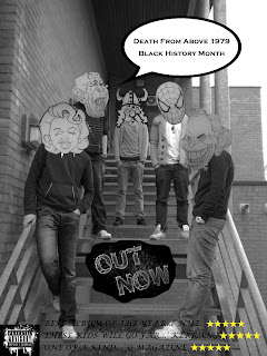
This being our DVD cover it empathizes the fact that the band want to keep that secret identity to them, but also grab our target audience’s attention which this does.
Below shows our CD cover with a DVD CD involved. IT shows one of the most showed character heads the Viking within our music video, we have put up different shots from our production. What we have done for all the three productions is kept with our serial convention, we have kept the black and white technique and just added in the red which again makes it stand out from others.
The group wanted to create a strong image, which was going to be recognizable throughout all the media productions. The combination with the animation and real footage brought a gritty and quirky feel that we wanted to be consistent through the video, Digi pack and magazine advert. This is what we wanted to it gives the band an identity like Goriallaz, that matches the genre of music following video and publicity.
The variety and the number of the band members were crucial in our video, from the main artists to not so main artists. Each character highlighted a different animated character to them. Each character was introduced with each scene getting more serial for e.g. Tony Blair was riding a bicycle which isn’t to be seen everyday. This shows a media convention of the specific and similar videos we have influenced as seen through Example, and Kidi Cudi.
2. How effective is the combination of your main product and ancillary texts?
By watching the music video and glancing at the Digi pack and Magazine advert you can see the huge continuity link of visual style between all three products. All three of them link to an identity toward the band which is the animated head, black and white look and the fast pace. Had there have been more time the animation could have been improves, however getting up to scratch like we did was a target we were happy with. The ancillary texts do well to support our music video, the feeling of the bands look and uniqueness is ad what music genre they play.
.
This is the video clip from the “try life in another language” music video, this shows a great shot to show another serial effect which makes a good flowing technique, which with this sought of filming the flow from scene to scene needs to be good.
This is our shot which is very similar; we used this shot so it could make the continuity better and make the flowing of the production work well which it did.
There is a correspondence between our main product and our ancillary texts; I believe as a group we did a very good job of making each one have a specific and distinctive look which is similar to each other. The show good combination together as the Magazine advert and Digi Pack shows the secret identity of the fiver bad members, they display the band members also they display some shots from the footage we took, so posing shots. Some of our serial genre elements are also obvious and pop up into our ancillary task but not too much as this will completely be portraying how serial and unlike normal media genres we aren’t. By showing normal and non specific clothing throughout the production again didn’t give out too much detail on what type of genre the band are trying to full fill. The composition of the Digi pack consists largely on similar photo set within a notion of looking such as camera film.
We have a split screen of the same thing happening just with diverse camera angles, this shows the name of the band as this could be there signature music video to represent the band. We have followed a lot of the music genres to show the best of all but we have put it all in to context and it has worked very well, our genres show a good resemblance to the ancillary texts.
The idea behind our final media product were very clear, this is what our group set out to achieve, we had planned well and our essential planning had initially come close to what we wanted it to be, therefore there being not as many changes between the product and ancillary texts. In relation to the audience, there is a combination between our main product and ancillary tasks, I feel that the Digi pack has a very formal yet bouncy style to it; where as our main video product would be targeted at a predominantly younger audience. I have mentioned the colour and style briefly however we had a set colour scheme through the ancillary texts and Digi Pack and Magazine advert, each being very similar to each other. We went for a black and white effect but had to really control how black or white it was due to the different sets of contrast. The very un-toned colour, which immediately doesn’t strike the audience, this is why we added the animated heads with black and white to make it all similar and work together. The whole package we have gone for portrays the band in a mature, natural yet bouncy effect, the effect that stands out.
This is on final cut express, the way the group made the contrast of the colour, a specific black and white.
What have you learnt from your audience feedback?
Throughout the production we have done on our music video, Digi Pak and Magazine Advert, our group has received a lot of feedback from many people within our class, Most of it has been constructive criticism, some has been positive and some has been negative, mainly towards our rough cut, therefore we had to make our final production better. On receiving both critical and constructive feedback from the rest of the group we were able to draw evaluations as to where the group went wrong and what worked well so we could have done more of. One of our main feedback negatives was that we didn’t match our lyrics with visuals, this is very clear in our video that we did not do this, we thought about points in the lyrics which would match well with out actions. However as our video was so serial, it was acceptable to go out of the box with the visuals and lyrics and have mini narrative stories, the audience felt this would work and also as there were so little lyrics to play with it was the perfect way to edit the video. One convention we directly put forward in our music video was a Goodwin point through Goodwins criteria, it was the showing and use of intertextual reference. We used this well and this was part of constructive comments, we used this to expand and improve our video. We had a variation of hard camera shots to put into production, such as some difficult tracking shots to work with, especially when the tracking shots had faces in them as each face had to be cut and slightly moved every second o this took a lot of time and everyone commented on the fact how this would have taken a very long time and if had more time it could have been a extreme master piece.
This is our final cut express and it shows how many times we had to cut the shots so they would get this sketchy and hard effect to work with.
This show shows how hard it was to cut all the time on final cut express, we had to make it as clean but also as quirky as possible to get the effect we wanted.
Feedback on the rough-cut was very important as it enabled our group to make alternations to improve our product, in terms of the camera work again, people said due to the amount of track shots you did it was good that there was no shakiness or wobbling with the camera, and you used a good number and variation of shots. By having ours shaky and wobbly made it acceptable though as when the animated heads moved it came up fairly wobbly and shaky so this worked well. The music video fitted the conventions of a serial music genre. These critics helped a lot for feedback from the group concerning our ancillary tasks. Firstly, the use of the band being covered with animated heads showed brilliant consistency through the Digi pack, magazine advert and music video. The feedback generated also made us stick to the black and white theme which we kept through all the productions. With the CD cover we were told the red was too much, however we decided to keep it as our band went for the look where it jumps to our target audience. We made a lot of changes on our colours especially, we essentially didn’t have the black and white effect and it was in colour; however we went to the black and white because it made the animated heads not look silly as you could see the outline as they had been cut on photo shop. We went for this black and white effect because the black and white looked far better with the animation.
4. How did you use new media technologies in the construction and research, planning and evaluation stages?
We used lots of media technology, within our planning also editing and evaluation, Photoshop was keen to out media production because we had to cut out all the animated faces. This was complicated as we used many pictures and cut many more photos on photo shop we used within our media video. We also used Final cut and websites and typical media equipment. Firstly, throughout the duration of our research stage, YouTube website was an important technology our group had to look into greatly, the element of research enabled our group to develop understanding of other music videos that corresponded with the serial and the diverse genre our music video consists of. We looked a great deal into bands that had specific ideas as we did like mentioned, Gorillaz, example and Kidi Cudi. We could embed the videos and research we did into our blog this enabled us to evaluate it and draw comparisons between its conventions and our conventions we would use in our product. During the making and construction of the media production, we used the final cut express which really helped our group especially with all the cutting we had to do with the animation. Especially with all the track shots as well this was good to use for final cut as it helped us enormously to cut down the shots. When doing the Digi pack and Magazine advert we used a range of filters and colours which had that secret identity the group wanted. We did a flick book which enabled us to make some of the faces move, e.g. in our video the eye being pulled out we had to do a small flick book so it looked like an electrical bolt was pulling the eye out.
In what ways does your Media product use, develop, or challenge forms of real media products?
Throughout our Music Video, Digi pack and Magazine advert our group has produced very serial productions and merchandise. Real media music productions which have really influenced our group have been the bands that show off a vibrant yet serial music video; Artists such as: Gorillaz, Example, and Kanye West, each of these bands have gone for a specific look which grabs the audience attention. Our main convention is having the band member’s faces covered up throughout most of the video, these heads being very different and heads that are well known and famous in the world to date, like Mickey Mouse, Spiderman and President Bush. Kidi Cudi ‘Day’N’Nite’video matches our conventions fairly well where there is a bunch of diverse heads throughout the video.
You can see the similarities between our music genres; we have gone for a similar establishing shot to establish the different characters.
Furthermore, as a group we went for an affect which will grab the audiences attention, by doing this we have gone for no ordinary typical convention, this making our genre very diverse, like no ordinary music genre such as: pop, rock, metal or R&B, these common genres follow a very stereotypical video for the genre, for e.g. R&B you will always get the rapper or DJ rapping/dancing to the song lyrics, (never leave you by Tinchy Styder shows a great example of this). Therefore our group went out the box to be different and make it eye catching for our specific target audience. In all videos the lyrics are sung by the artist, however in ours we have placed animation over the heads of our five band characters and are singing along to the lyrics through an animated head, on the other hand a few people in the band do not have their heads showing due them not being members of the band, they are just the public, this again enhances the fact how we want there to be a secret identity to who the band members are, so by doing this, this makes the audience attached to the band and video as this is a different way of producing a music video.
The Digi pack and magazine advert have evolved around the prospect and idea of their being heads on our bodies, we have gone for the band look with faces on the magazine advert, this promotes the band and its name. We wanted to keep the identity of the characters still similar to the music video also to grab the audience’s attention with our different serial media conventions.
This being our DVD cover it empathizes the fact that the band want to keep that secret identity to them, but also grab our target audience’s attention which this does.
Below shows our CD cover with a DVD CD involved. IT shows one of the most showed character heads the Viking within our music video, we have put up different shots from our production. What we have done for all the three productions is kept with our serial convention, we have kept the black and white technique and just added in the red which again makes it stand out from others.
The group wanted to create a strong image, which was going to be recognizable throughout all the media productions. The combination with the animation and real footage brought a gritty and quirky feel that we wanted to be consistent through the video, Digi pack and magazine advert. This is what we wanted to it gives the band an identity like Goriallaz, that matches the genre of music following video and publicity.
The variety and the number of the band members were crucial in our video, from the main artists to not so main artists. Each character highlighted a different animated character to them. Each character was introduced with each scene getting more serial for e.g. Tony Blair was riding a bicycle which isn’t to be seen everyday. This shows a media convention of the specific and similar videos we have influenced as seen through Example, and Kidi Cudi.
2. How effective is the combination of your main product and ancillary texts?
By watching the music video and glancing at the Digi pack and Magazine advert you can see the huge continuity link of visual style between all three products. All three of them link to an identity toward the band which is the animated head, black and white look and the fast pace. Had there have been more time the animation could have been improves, however getting up to scratch like we did was a target we were happy with. The ancillary texts do well to support our music video, the feeling of the bands look and uniqueness is ad what music genre they play.
.
This is the video clip from the “try life in another language” music video, this shows a great shot to show another serial effect which makes a good flowing technique, which with this sought of filming the flow from scene to scene needs to be good.
This is our shot which is very similar; we used this shot so it could make the continuity better and make the flowing of the production work well which it did.
There is a correspondence between our main product and our ancillary texts; I believe as a group we did a very good job of making each one have a specific and distinctive look which is similar to each other. The show good combination together as the Magazine advert and Digi Pack shows the secret identity of the fiver bad members, they display the band members also they display some shots from the footage we took, so posing shots. Some of our serial genre elements are also obvious and pop up into our ancillary task but not too much as this will completely be portraying how serial and unlike normal media genres we aren’t. By showing normal and non specific clothing throughout the production again didn’t give out too much detail on what type of genre the band are trying to full fill. The composition of the Digi pack consists largely on similar photo set within a notion of looking such as camera film.
We have a split screen of the same thing happening just with diverse camera angles, this shows the name of the band as this could be there signature music video to represent the band. We have followed a lot of the music genres to show the best of all but we have put it all in to context and it has worked very well, our genres show a good resemblance to the ancillary texts.
The idea behind our final media product were very clear, this is what our group set out to achieve, we had planned well and our essential planning had initially come close to what we wanted it to be, therefore there being not as many changes between the product and ancillary texts. In relation to the audience, there is a combination between our main product and ancillary tasks, I feel that the Digi pack has a very formal yet bouncy style to it; where as our main video product would be targeted at a predominantly younger audience. I have mentioned the colour and style briefly however we had a set colour scheme through the ancillary texts and Digi Pack and Magazine advert, each being very similar to each other. We went for a black and white effect but had to really control how black or white it was due to the different sets of contrast. The very un-toned colour, which immediately doesn’t strike the audience, this is why we added the animated heads with black and white to make it all similar and work together. The whole package we have gone for portrays the band in a mature, natural yet bouncy effect, the effect that stands out.
This is on final cut express, the way the group made the contrast of the colour, a specific black and white.
What have you learnt from your audience feedback?
Throughout the production we have done on our music video, Digi Pak and Magazine Advert, our group has received a lot of feedback from many people within our class, Most of it has been constructive criticism, some has been positive and some has been negative, mainly towards our rough cut, therefore we had to make our final production better. On receiving both critical and constructive feedback from the rest of the group we were able to draw evaluations as to where the group went wrong and what worked well so we could have done more of. One of our main feedback negatives was that we didn’t match our lyrics with visuals, this is very clear in our video that we did not do this, we thought about points in the lyrics which would match well with out actions. However as our video was so serial, it was acceptable to go out of the box with the visuals and lyrics and have mini narrative stories, the audience felt this would work and also as there were so little lyrics to play with it was the perfect way to edit the video. One convention we directly put forward in our music video was a Goodwin point through Goodwins criteria, it was the showing and use of intertextual reference. We used this well and this was part of constructive comments, we used this to expand and improve our video. We had a variation of hard camera shots to put into production, such as some difficult tracking shots to work with, especially when the tracking shots had faces in them as each face had to be cut and slightly moved every second o this took a lot of time and everyone commented on the fact how this would have taken a very long time and if had more time it could have been a extreme master piece.
This is our final cut express and it shows how many times we had to cut the shots so they would get this sketchy and hard effect to work with.
This show shows how hard it was to cut all the time on final cut express, we had to make it as clean but also as quirky as possible to get the effect we wanted.
Feedback on the rough-cut was very important as it enabled our group to make alternations to improve our product, in terms of the camera work again, people said due to the amount of track shots you did it was good that there was no shakiness or wobbling with the camera, and you used a good number and variation of shots. By having ours shaky and wobbly made it acceptable though as when the animated heads moved it came up fairly wobbly and shaky so this worked well. The music video fitted the conventions of a serial music genre. These critics helped a lot for feedback from the group concerning our ancillary tasks. Firstly, the use of the band being covered with animated heads showed brilliant consistency through the Digi pack, magazine advert and music video. The feedback generated also made us stick to the black and white theme which we kept through all the productions. With the CD cover we were told the red was too much, however we decided to keep it as our band went for the look where it jumps to our target audience. We made a lot of changes on our colours especially, we essentially didn’t have the black and white effect and it was in colour; however we went to the black and white because it made the animated heads not look silly as you could see the outline as they had been cut on photo shop. We went for this black and white effect because the black and white looked far better with the animation.
4. How did you use new media technologies in the construction and research, planning and evaluation stages?
We used lots of media technology, within our planning also editing and evaluation, Photoshop was keen to out media production because we had to cut out all the animated faces. This was complicated as we used many pictures and cut many more photos on photo shop we used within our media video. We also used Final cut and websites and typical media equipment. Firstly, throughout the duration of our research stage, YouTube website was an important technology our group had to look into greatly, the element of research enabled our group to develop understanding of other music videos that corresponded with the serial and the diverse genre our music video consists of. We looked a great deal into bands that had specific ideas as we did like mentioned, Gorillaz, example and Kidi Cudi. We could embed the videos and research we did into our blog this enabled us to evaluate it and draw comparisons between its conventions and our conventions we would use in our product. During the making and construction of the media production, we used the final cut express which really helped our group especially with all the cutting we had to do with the animation. Especially with all the track shots as well this was good to use for final cut as it helped us enormously to cut down the shots. When doing the Digi pack and Magazine advert we used a range of filters and colours which had that secret identity the group wanted. We did a flick book which enabled us to make some of the faces move, e.g. in our video the eye being pulled out we had to do a small flick book so it looked like an electrical bolt was pulling the eye out.
Thursday 10 December 2009
The Script
Group commentary question 3
What have we learnt from our target audience feedback?
William Wade: throughout the time of filming our music video an writing up our blog, we have received a lot of feedback from many people within our class. Most of it has been constructive criticism, some has been positive and some others have been negative towards our rough cut and also our blog
Henry Wade: We have looked at this feedback we have received and used it as a benefit towards wring our blog and doing our music video.
William Wade: The feedback we received from many different people and we had many different opinions of things we had done but like i mentioned we have used this criticisms to make out
Group Commentary question 2
How Effective is the combination of your main product and ancillary texts?
William Wade: Just by looking at the digi-pack, magazine advert and music video at a glance, you can see there is a definite continuity of visual style.
Gareth Bowen: All three products link to the identity of the band which is the animated heads, black and white look and fast pace. We feel that if we had more time then maybe the animation could of been improved but are still satisfied with the outcome of all three products.
Henry Wade: The ancillary texts do well to support our music video. You get a feel from them of what the bands identity is and what music genre they play.
group commentary question 1
In what ways does your media product use,develop, or challenge forms of real media products?
Henry Wade: Our music video, digi pack and magazine advert were very serial, we have been influenced by some huge artists in the music industry, such as; Gorillaz, as they cover their identity to the public so no one knows who they are in their videos.
Ashley Andrews: As a group we have gone for an effect which will grab the audiences attention, however we have used no typical conventions so the genre is very diverse, like no typical basic genre such as pop, rock, metal and r&b, these common genres follow very normal videos for their specific genre so by our group going out of the box made it very eye catching for our specific target audience.
Gareth Bowen: In all videos the lyrics are sung by the artist, however in ours we have placed animation over the heads of our band members and are singing along to the lyrics through a animated character head. On the other hand not all of the bands members heads are covered with an animated head all the time because we wanted to promote the bands features.
William Wade: this was our idea to promote the band and the idea of our filming.
Gareth Bowen: The digi pack and magazine advert have evolved around the idea of our heads being on bodies, we have gone for the band look with faces on the magazine advert, this promotes the band and its name, we wanted to grab the audiences attention but also keep it similar to the music video we did, so keep the serial conventions.
Henry Wade: We wanted to create a strong image that is recognizable with the group, the combination with animation and real footage brought a gritty and quirky feel that we wanted to be consistent through the video and the digi-pack.
Ashley Andrews: This gives the band an identity that matches the genre of music for following video and publicity.
Group commentary question 4
How did you use new media technology in the construction and research, planning and evaluation steps?
William Wade: We used lots of media technology within out planning also editing and also evaluation, Photo shop was very complicated as we used many pictures and cut many photos on photo shop we used within our music video.
Gareth Bowen: Also did a flick book which enabled us to make some of the faces move, E.G in our video the eye being pulled out we had to do a small flick book so it looked like someone was pulling the eye out.
Gareth Bowen: Things such as photo shop and final cut express took us quite a while but we managed to finish things off and look very good. We also did lots of internet research within our planning stages. Going on Youtube and analyzing lots of media footage and music videos.
Friday 4 December 2009
question three
what have we learnt from our target audience feedback?
throughout the time of filming our music video an writing up our blog, we have received a lot of feedback from many people within our class. Most of it has been constructive criticism, some has been positive and some others have been negative towards our rough cut and also our blog, but we have looked at this feedback we have received and used it as a benefit towards wring our blog and doing our music video.
The feedback we received from many different peopel and we had many different opinions of things we had done but like i mentioned we have used this criticisms to make out blog and our video even stronger and better.
Thursday 3 December 2009
Group Commentary question 2
How Effective is the combination of your main product and ancillary texts?
Just by looking at the digi-pack, magazine advert and music video at a glance, you can see there is a definite continuity of visual style. All three products link to the identity of the band which is the animated heads, black and white look and fast pace. We feel that if we had more time then maybe the animation could of been improved but are still satisfied with the outcome of all three products. The ancillary texts do well to support our music video. You get a feel from them of what the bands identity is and what music genre they play.
MUSIC VIDEO
DIGI-PACK

MAGAZINE ADVERT

group commentary question 1
In what ways does your media product use,develop, or challenge forms of real media products?
Our music video, digi pack and magazine advert were very serial, we have been influenced by some huge artists in the music industry, such as; Gorillaz, as they cover their identity to the public so no one knows who they are in their videos. As a group we have gone for an effect which will grab the audiences attention, however we have used no typical conventions so the genre is very diverse, like no typical basic genre such as pop, rock, metal and r&b, these common genres follow very normal videos for their specific genre so by our group going out of the box made it very eye catching for our specific target audience. In all videos the lyrics are sung by the artist, however in ours we have placed animation over the heads of our band members and are singing along to the lyrics through a animated character head. On the other hand not all of the bands members heads are covered with an animated head all the time because we wanted to promote the bands features.
this was our idea to promote the band and the idea of our filming.
The digi pack and magazine advert have evolved around the idea of our heads being on bodies, we have gone for the band look with faces on the magazine advert, this promotes the band and its name, we wanted to grab the audiences attention but also keep it similar to the music video we did, so keep the serial conventions. We wanted to create a strong image that is recognizable with the group, the combination with animation and real footage brought a gritty and quirky feel that we wanted to be consistent through the video and the digi-pack. This gives the band an identity that matches the genre of music for following video and publicity.
Group commentary of music vid plan
We have been given a task of doing a group commentary. This is to talk about our music video in detail to a watching audience. Within our commentary we are going to include a range of different shots such as an establishing shot of all group members and use of close ups when individually talking about the video. Will also include flashbacks to our music video so when talking we can refer back to our music video when wanting to.
Doing this commentary will allow us to talk about our video in detail and if there is things people don't understand can talk about them./
Doing this commentary will allow us to talk about our video in detail and if there is things people don't understand can talk about them./
Tuesday 1 December 2009
1. Promotes the band well, it stands out.
2. Promotes the video well by using screen grabs and drawings from the music video.
3. It's artistic and original. The faces entices people to read it. The dvd cover and magazine ad are simple yet affective.
4.
Feedback to digi pack
- Images on the back work well as they relate to video
- Lacking some information such as production logo
- The colour scheme does not really look like they fit with the video very much
- Just screen grabs from that video even though it contains other videos
Feedback to magazine cover
- Writing is hard to read because of the background
- Does not say where to buy the album
- Liked the rating
- The black and white relates well to the video
- The speech bubble is a good idea

DVD COVER

I wanted to do something quick eye catching with a minimal modern style. I used members of the band pulling and ripping off the titles of the DVD cover. This Combined also the elements of the video with a consept of the band in this other world, also bringing together animation and real life.

Thursday 26 November 2009
our magazine advert so far
This the image that is going to be the background:

Our magazine advert is going to advertise the CD cover we are producing.
We are going to put surreal heads on their heads. The heads are going to be from the music video. The advert is also going to have the name of the band and the name of the CD at the top of the page. At the bottom will be when it is released and where. It is also going to have ratings from newspapers and various music magazines. Parental advisory logo is also going to be featured.
Tuesday 24 November 2009
Initial ideas!
CD COVER
-use the heads from our music video on the front
-our band is alternative so we want surreal images on the CD
-band name or album name or both?
-black and white
-The font can be rough and messy to suit the image of our band
DVD COVER
-same as the CD cover but on the back it will include shots from the music video
-black and white
-all songs listed
-band name or album name or both?
MAGAZINE ADVERT
-where and when you can buy the DVD/CD
-price?
-similar design to the DVD and CD cover but with more visuals and images
-heads from the music video
-black and white
-animated heads
Conventions of a magazine Advert
Magazine adverts generally look similar to the DVD/CD that they are promoting. Pop and indie music groups generally have the bands photo on the cover and more alternative groups generally have a logo that relates to their genre of music. They also include where and when you can buy the CV/DVD and sometimes the price. They will also generally have the bands name/album name.
Digi-pack
For the next part of our project we are going to make a digi-pack which relates to our music video. This will include a CD/DVD cover design and a magazine advert promoting this CD or DVD.
Normally on a CD/DVD cover there is the bands name so the customer knows what brand they are buying. There is also an image that show the bands image. This can be either a photo of the band or their logo. Pop and indie music groups generally have the bands photo on the cover and more alternative groups generally have a logo that relates to their genre of music. Also is the name of the album and sometimes some of the singles that are included in that album. If it is a DVD then special features are sometimes mentioned.
We will keep all of these things in mind when constructing our CD or DVD cover.
Friday 20 November 2009
analyse of 'the friendly fires' mag advert2
 am going to analyze the advert for 'the friendly fires' they are the band of the summer and have a series of hits such as: the skeleton boy and kiss of the life.
The advert itself is a standing out colorful advert which can grab the attention of the viewer quite easily. Its quite hard to see what the bands genre is, as there is no sign of any rock or RNB within the advert. Also it doesn't show any sign of where the CD can be brought.
It does clearly state that it is a good CD as it states that it was 'The Mercury prize nominated album' and 'The band of the summer' said by the observer.
You can clearly see who the band are as they are in the middle of the page standing out so you know exactly who the band our and how they look.
Thursday 19 November 2009
analyse of mag advert 1

It is very clear where and when you can purchase this album. It states exactly what you will get including a free Marshall Amp which will entice people to buy which is very clever.The advert is mainly focused on the free amp to entice customers.
Final video feedback
Overall we were pleased with our feedback, there were so good comments and on the whole we agreed on the sort of style and look we were going for. There were some things that we weren't pleased with. We were hoping that the animation would cover all of the faces, but there wasn't the angles on animation so the real footage went with the animation. Also we had some animation so the characters were lip sinking and moving there mouths but because of the lack of time and poor planning we didn't manage to put that on there. However there were good points...
People felt that the edge sketchy look was good and matched the music.
Like that s wasn't a narrative that we stuck to and the animation allowed us to be free in our editing choice even though editing was really time consuming and challenging.
The drawings were a good quality and added some a profectional look to it.
Editing and fantasy elements was good and over all idea was interesting and quite unique.
Tuesday 10 November 2009
Animation
Here are more sketches for our animation on our music video; these sketches are sketches Gareth has drawn to include in our video, these are not all of the sketches but a few we have included into our video. Our video is including some serial and animated pictures and we have managed to make it look very effective by making them move. We have included them in our video and with the actors in the video thinking they are seeing things.
This works very well and make our video unique and different than any others.


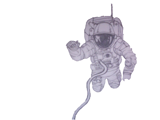
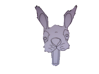


This works very well and make our video unique and different than any others.


Friday 6 November 2009
Production meeting 4
We are now in the final stages of completing our music video. With two weeks to go we have not got long left. We have the opportunity to come in some evenings and get some extra hours of editing done. Ashley is going to come in on wednesday evening from 5pm till 8pm and then gaz, william and henry are coming in on thursday evening from 5pm till 8pm.
We have shot all the footage we need so all we need to do now is concentrate on the editing part. It wont be easy but we all committed to producing a very good music video.
We have shot all the footage we need so all we need to do now is concentrate on the editing part. It wont be easy but we all committed to producing a very good music video.
Teacher feedback
This blog is looking great but it would be good to see you all adding blogs from home as it seems that lessons are being used a little too much to blog rather than do practical work such as editing. Your sketches must be put on the blog as where you have done this, it really strengthens your blog as it shows practical progression of your idea. You MUST also start editing your sketches (animating) as even with the extra edit evening you are cutting it extremely fine and I am concerned that your amazing idea it going to have to be sacrificed in some way in order to get it done on time.
Feedback
We were quite pleased with our feedback, we knew that the rough cut was very far from our final idea and being completed. Also the animation is very rough its isnt as finished as it will be. Many people picked up on this, saying shots looked random. And they do without the animation, but when that put in feel it will look normal. People commented on the fact they liked the black and white effect that we added, which we were pleased with. Also peole liked the mise en scene and sort of gritty urban suroundings that we used. We were aware we had alot to do still and predicted that people we comment on that however the feedback not about his was really helpful and we were pleased with the good comments we recieved.
This video, in some ways is very different to ours. The type of animation and the fact it isnt a music video. Beside the fact I just really like it and it very unusual, I really like the scratchy doodley look to the characters and drawings. It has a rough almost home made feel that we would like to achieve. Further more this scratchy unacomplished look, reflects the music of the band less regonised and not mainstream.
Thursday 5 November 2009
Editing so far
These are some screen grabs of how the editing of our music video is going so far;
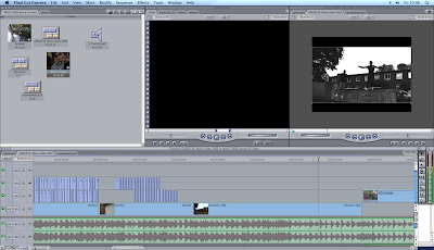
In this part of the editing we reversed the footage to make the main characters appear to be jumping back up onto the wall.
 After a minute of the music track the lyrics talk about the city so we included some mise en scene footage of the city cambridge that was shot out of a car window and sped it up by 900%
 This the start of our animation and as you can see we need to cut the animation and move it every time the main characters head moves. This is very time consuming but when finished it really works.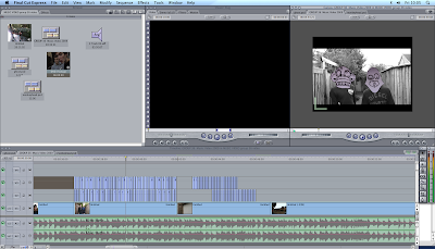

rough cut
This is a very rough cut of our music video at the moment and we know that we have alot of work ahead of us. Most of which is the animation
Target audience
Our target audience, isnt clearly defined by age, sex or music type. We feel it is a wide group of men and women raging in age, probably with a wide range of intresting in music and videos. There isnt a clear group that we are targeting. Our video is quite unusual and creative not typical of ordanary rock of videos from other genres. Further more As the groupis sort of playing and alternative style of music the video matches this by also being quite unusual. I feel this will target out audience quite well.
target audience
The Target Audience is the audience our video is set too, what age group and what kind of people we want this video to attract. Black History month played loud, heavy metal influenced, dance-punk on a bass and drums combination. So they as a band and music attract the more rock side of people. Our group using their song and creating the video has kept the rock audience but has also introduced a new audience of of the younger generation.
Black History Months style was quite heavy metal rock and this was also carried on for their DVD covers and C.D covers etc.

This picture shows what the style of Black History Month was and our style and image of our Music video is a bit different. The picture is very surreal and that is what we are going to do for our style. Their style by looking at the picture is very plain and different and ours will be more detailed and also surreal and different, this is to try and keep the same style and image of Black History Month but also create a new design and change it around to fit our music video.
We are in progress in creating our actually CD and DVD covers and we have used this image to help us to create our covers. Within our video we have used different faces and this is similar to the elephant Black history month have used but we have used more alien like faces and we are including these in our CD and DVD covers.
Black History Months style was quite heavy metal rock and this was also carried on for their DVD covers and C.D covers etc.


This picture shows what the style of Black History Month was and our style and image of our Music video is a bit different. The picture is very surreal and that is what we are going to do for our style. Their style by looking at the picture is very plain and different and ours will be more detailed and also surreal and different, this is to try and keep the same style and image of Black History Month but also create a new design and change it around to fit our music video.
We are in progress in creating our actually CD and DVD covers and we have used this image to help us to create our covers. Within our video we have used different faces and this is similar to the elephant Black history month have used but we have used more alien like faces and we are including these in our CD and DVD covers.
location shots in cambridge and linton


These are shot from some of our earlier footage, we are using these as a rough guide to know where to animate the heads etc. This is acting a basic guide so they don't look out of proportion.
Tuesday 3 November 2009
A summary of what we need to do
This is a summary of what we need to do in order to complete our music video project.
FILMING
So far we have shot around half of our footage. We have acquired our own camera for shooting and going to film the rest of our music video footage within the next week.
What we need to shoot;
EDITING
We have already started the animation for our music video as demonstrated in the test footage. And we have all the drawings and sketches so all we need to do is apply to the footage in final cut.
inidividual evaluation of how the filming and editing has gone
as a group so far we have got quite far into the filming progress and have managed our idea of putting crazy looking faces on our actors and has come out looking pretty good. We have done a few hours of filming in different locations and we are now in the process of editing it on finalcut and getting it finished.
What has gone well and not so well?
During the filming we have had some great success of catching some great shots and managing to make them look great within editing them within finalcut express. Also another good thing we have done is manage to get together as a group and work with each other to create a great music video.
Most things have gone pretty well so far apart from a few mistakes we have made as a group, a lack of organization is not helping us as we as a group are not chatting to one another about picking up cameras ECT. We dealt with this problem by getting a camera from family members, this benefited us a lot as we got some extra filming hours.
During our filming and editing nothing has gone to wrong and most things have been quite a a success.
Sunday 1 November 2009
individual evaluation of how filming and editing has gone so far - ASHLEY
As a group we have had our ups and down on this part of the project. Our planning and research went really well and was next to perfect. But when it came to the filming and editing process we did have some difficultys but delt with them the best we could.
What went well:
We chose some really nice locations to shoot. The first was in cambridge city centre. We were looking for a rough urban area to go well with the music video and we found a few areas. We also shot in Linton and managed to get abit of footage.
When editing we decided to desaturate the footage to go well with the animations and this worked well. We have started some of the animations and they work on the footage. It is very time consuming but we are willing to spend extra time of this project.
Problems we have faced:
From the first day of filming we have faced problems. When in Cambridge our tripod didnt work fully so the footage was shaky and not still. Fortunally the media department reliased that this was their fault and gave us more time to shoot. So we organised a full day to shoot on a sunday. We had our own camera but had the wrong discs for it and couldnt find any anywhere. But the last placed we tried had the right discs. But by this time there was only a couple hours of daylight left so we didnt manage to get all the footage we needed.
Due to this our rough cut was only half done.
But we are working hard to compleate this project. We have arranged a few more days to shoot and extra time to edit.
Thursday 29 October 2009
individual filming and editing for rough cut
As a group we have filmed well and edited well, however, we are not close to finishing our project even the rough cut. There is still a lot of editing to do and some filming.
1. What went well- When filming we did manage to get a lot done in one night, we filmed some good footage that is going to be put into our final production, we worked well as a team and found good locations to film.
2. There were little points that went particularly well due to the fact of how many problems we encountered during the first day of filming. These made it very hard to film well or according to the plan, the biggest problem we encountered was:
-when we pulled out our tripod from the case one of the legs did not come out which meant that we could not use a tripod so all of our shots are shaky and we had to use many track shots, even though track shots are good because they can be done whilst looking shaky we could not do half the filming we intended to do, this meant we were a day behind in filming which put us behind significantly. We dealt with this problem well, we spoke to our teacher and she thankfully said it was the media departments fault and that they were willing to give us an extra day.
- another huge problem was that we intended to film by this huge lake which was a brilliant idea so we could make it serial, with sharks and dolphins jumping out of it. However we couldn't do this because the lake has been closed off and there was no entrance. We dealt with this well, we basically had to look through the script ad come up with a new idea for that part of the music video, we did this buy looking at other simple aspects like a bus stop and drawing serial and odd drawings and people at this bus stop to show a different contrast in people and objects.
Tuesday 20 October 2009
Dirty harry
This is video from Gorillaz, a band that's identity is under animation, and the band are jnown as these cartoon people. This video 'Dirty Harry' is a very similar video to ours, combining reality (real shots) and animated people and characters. It has quite a gritty quality making it seem more dark and not child like, this fits well with there style of music. This is something I think we should try to bring into our video.
Friday 16 October 2009
Animation


Throughout our film we have this animation and sketchy idea which is a work in progress an it is really going well. The music video by example watch the sun come up is a perfect video to show the sketchy look and the black and white sketches which we are trying to put forward in our video. The screen grabs above are similar shots and ideas we will be using in this weekends shooting we are doing. 17th and 18th October 2009 is when we will be doing our shooting and filming, then we'll be editing the whole music video and make it work for our music video.
Animation characters

This is a sketch, of a character that will feature in our video. Its quite abstract and strange, a weird monkey with braces. We have tried to produce something that is uite striking as a character, ith bold feature that stand out. Also we quite like the D.I.Y asthetic feel, with the animation looking a bit amateur. I feel this in a way reflects the band not being very main stream it suits their style and a bit underground and un heared of.
Thursday 15 October 2009
Test footage
Here is some test footage we shot and edited. We added some animation and it works! Obviously the animation here, is very simple. When it comes to the real thing we will get the faces to move and expressions to change We now nowthat are way of doing that will work because of this test footage :)
analyse of music video
Looking at our idea of making our video more serial and unrealistic i have looked at a video which is a little similar to what we are trying to do, some of the shots within this video work very well and are alike what we want to do. Here are a few captiones of the video itself to show you some of the shots.


Looking at these images i have used of the Eminem video it is mostly all cartoonized but there are some similar shots of a real person standing in a different world which is what we are hoping for our video to be like.


Looking at these images i have used of the Eminem video it is mostly all cartoonized but there are some similar shots of a real person standing in a different world which is what we are hoping for our video to be like.